Mapping the future: land use | climate | food

A Project by SEDA Land and the Huntly Community.

This project – Mapping Land Use, Climate Change and Food – has developed over the last couple of years from an idea into funded reality and now SEDA Land is looking for volunteers to help organise events around Huntly.

AIMS

The Project will work with the community of Huntly [1], Aberdeenshire, to investigate the impact of climate change and alternative food systems on the local area.

SEDA Land writes: “We will investigate the long-term effects of land-use decisions on climate change and the food chain using a variety of tools over the next three years. This will be a collaboration between the community, artists, scientists and local landowners. We will also involve innovative food producers and farmers.”

All the tools proposed in this project are aimed to help the community understand and visualise a possible alternative and productive ecological landscape that serves the climate, the community and which could lead to innovative new forms of employment in the area.

This proposal addresses three of the recommendations from SEDA’s
“A New Vision for Land Use in Scotland 6 Conversations” published in partnership with the SRUC and the James Hutton Institute in August 2021, in particular the healthy food strategy [2].

SEDA Land is part of the Scottish Ecological Design Association (SEDA).
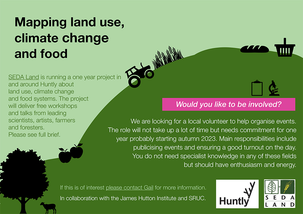
Advertisement for the Land Mapping project

Why Huntly?

Huntly was chosen because it is a good example of a mid-sized (population of 4,460) highland town, where surrounding farmland is predominantly used for grazing. We will be seeking to dispel the stereotypical view of the Highlands as sheep-grazed uplands, and explore the potential for alternative land uses – introducing the local community and local farmers to the scope for growing food on slopes; seasonal food; foraged food and indoor-grown food. We will also demonstrate that alternative farming brings increased biodiversity, carbon storage and other benefits.

SEDA Land already has strong connections with Huntly Development Trust, The Deveron Project (a local arts group) and The Gordon Schools (local primary and secondary schools). The development trust owns 63 acres of community land at Greenmyres, five miles southwest of the town. This should permit any residents who are inspired by our project to start using the land in a regenerative way for themselves. We have also established links with Beldorney Estate where we are able to run workshops and the arts projects.

“I think it is really helpful to use art to get past the usual narratives in which there is a designated ‘bad actor’ – a ‘villain’ to protest against. I think art can be great at showing our common humanity and showing that the ‘villain’ is not a person or group of people, but certain aspects of human nature, and of course, climate change itself”.

Sophie Cooke, artist

Toolbox

These tools are intended to engage people in new ways of thinking about the land, climate change and their food systems.

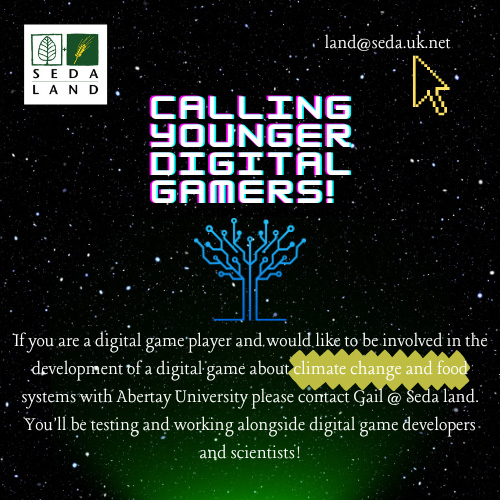
An interactive computer game – the digital game is being developed by students at Abertay University in Dundee to highlight the complex interrelatedness of climate change, biodiversity, land use and food sourcing . Primarily aimed at 13-45-year-olds, the game will require players to balance the uses and products of land to the best advantage of the community and the planet, measured in outcomes such as carbon capture, food sovereignty and health and well-being. We believe it is easier for people to visualise the palimpsest of issues involved if these can be presented graphically and innovatively.

Biophysical data collection – The community will seek to define its present and future needs with the help of scientists and artists, addressing issues such as resilience and a “just transition”. Data will be collated about land use and food sourcing both locally and globally – covering soil health, vegetation and climate. New information will be gathered about local food sources and waste management.

Field workshops – Professionals (soil scientists, regenerative farming experts, forestry experts, food entrepreneurs etc) will run workshops with the Huntly community, local farmers, foresters and landowners to develop/complement the ecological themes above. Artists will use creativity and storytelling to communicate ideas between the various stakeholder groups.

Artistic pieces – Two community projects are planned to be run by a visual artist and a poet to produce works of art in the landscape around Huntly relating to the aims of the project and using material from the workshops.
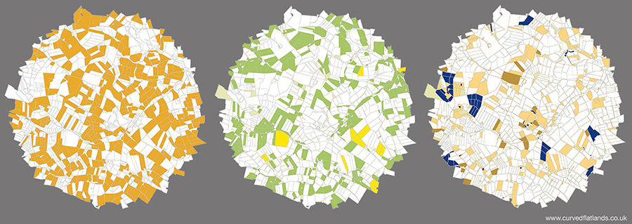
Mapping

We intend to use maps of all types to make it easier for people to visualise what effect climate change is expected to have on their local area – including in scenarios such as if there is no change to the current farming practices and in the event of bold and imaginative alternatives being adopted. These will include maps showing existing soil types, water, climate etc. along with maps drawn up with the community using local knowledge and drone footage.

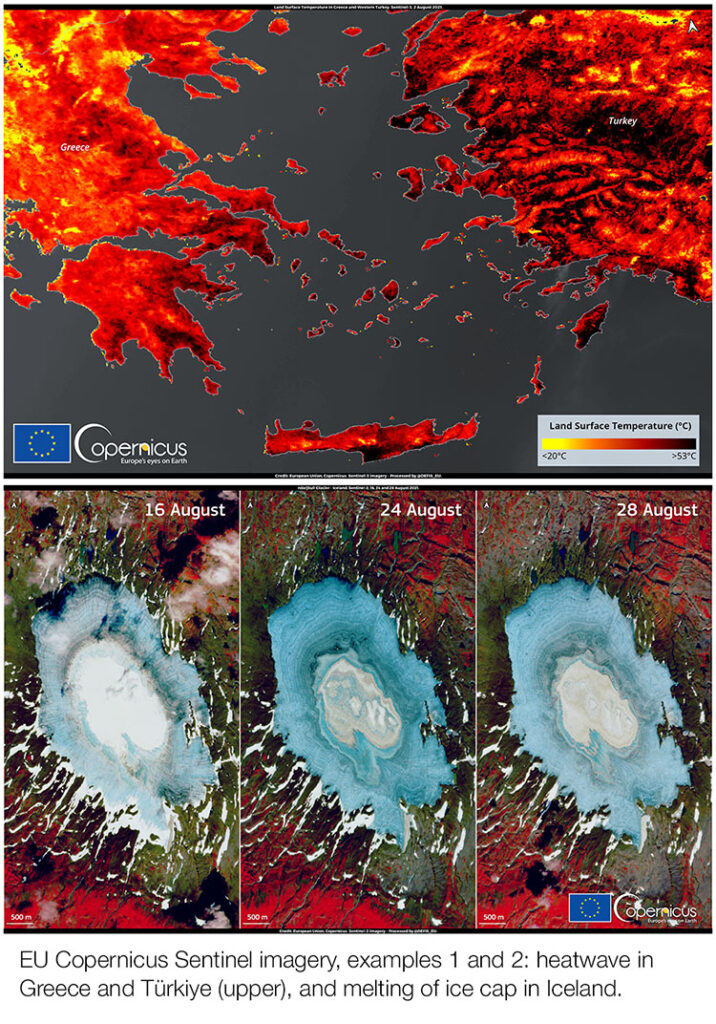
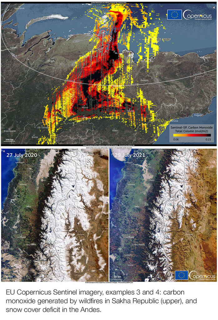
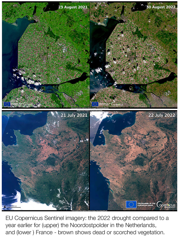
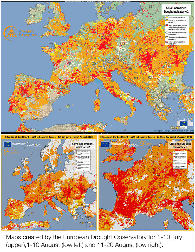
Examples of maps and mapping are given on the Living Field editor’s curvedflatlands web pages [3].

Mapping land use: an area (not Huntly) divided into fields and other land parcels by usage – grass for livestock (left), arable crops such as barley and wheat (centre), and the remaining agriculture and  woodland (right). Data from the James Hutton Institute. Original on curvedflatlands web [3].

The above text and image, apart from the maps, are extracted from the full project description available available as a PDF file [4].

For further info or if you want to be involved, contact Gail Halvorsen by email: land@seda.uk.net.

Sources | links

[1] Among organisations and people involved: Huntly Development Trust and Deveron Projects.

[2] SEDA Land is a part of the Scottish Ecological Design Association. The 2021 report is available as A New Vision for Land Use in Scotland – 6 Conversations downloadable from Past events and reports.

[3] On the curvedflatlands web at Community Mapping – food climate

[4] The following PDF file contains a description of the project, including those contributing.

Copernicus remote sensing – 2022 drought

Copernicus is a scientific Programme of the European Union – “Europe’s eyes on earth – looking at our planet and its environment for the benefit of Europe’s citizens” [1].

The Living Field frequently used data and images from the Copernicus Programme to inform and illustrate various articles on weather and climate in 2021 and 2022. Their coverage of major climatic and land-based events throughout the world gives some perspective and wider context to what is happening in Scotland’s arable-grass.

Image of the Day

Copernicus publishes an Image of the Day, which usually shows an environmental state or change of state in a defined region of the world – a serious flood, a melting glacier, wildfires, drought and high temperature, for example. If you sign up for it – Copernicus emails its images with a brief description and a link to their web site which holds the full resolution image and description [1].

The images provided by the Copernicus remote sensing satellites are free to view and download and to use with reference to the original source. Several of the images have been uploaded to the Living Field web to illustrate articles on weather and climatic shifts.

Here we show four examples of the Copernicus Image of the Day. They are among many that document the severe heat and drought affecting vast tracts of the earth in 2021. Text in inverted commas is taken directly from the Copernicus web site. 

Land Surface Temperature – Greece and Turkey

European Union, Copernicus Sentinel-3 imagery: Heatwave in Greece and Western Republic of Türkiye. Image of the Day 3 August 2021

The image, the first of the pair above, was created from measurements by radiometer on one of the Copernicus Sentinel-3 satellites on 2 August 2021. Summer temperature was extreme in Greece and western Türkiye – air temperature of 42°C at noon in Peléponissos and further south on the island of Crete; 46.3°C in Makrakomi, Greece; and 44°C along the coast of Türkiye. In hot dry conditions, soil temperature is usually higher than air temperature. The map shows soil temperature surpassing 53°C in some areas.  The original image can be found here

Melting of ice cap in Iceland

European Union, Copernicus Sentinel-2 imagery: Massive melting of the ice cap in Iceland. Image of the Day 30 August 2021.

The three images (example 2) “acquired by the Copernicus Sentinel-2 satellites on 16, 24 and 28 August provide evidence of the massive melting of Iceland’s ice sheets following the heatwave that has recently affected the island.“ The images show the Þrándarjökull glacier before, during and after the summer heatwave revealing a visible “shift from a situation of partial snow cover on the top of the ice sheet (on 16 August) to complete exposure of the older ice layers (on 28 August). Original here

Carbon monoxide (CO) in Sakha following forest fires

European Union, Copernicus Sentinel-5P imagery: Carbon monoxide generated by the wildfires in Sakha Republic (Russia). Image of the Day 1 August 2021

In summer 2021, Siberia experienced a severe fire season, “almost 500,000 km2 burnt by the end of July 2021. As a result of the fires, CO (a potent greenhouse gas) has reached values of 0.15 mol/m2, nearly twice as high as those recorded in 2020″. This image (example 3) shows the CO concentration in the Sakha Republic retrieved from data collected on 1 August. “The TROPOspheric Monitoring Instrument (TROPOMI) onboard the Copernicus Sentinel-5P satellite allows CO levels to be measured at an unprecedented level of detail on a global scale.” Original here.

Snow deficit on the Andes mountain range South America

European Union, Copernicus Sentinel-3 imagery: Snow cover deficit of Andes. Image of the Day 2 August 2021

In the winter of 2021, the Andes was affected by a severe drought. The reduction of snowfall (example 4) on both the Chilean and Argentinean sides of the range was made visible by data from by one of the Copernicus Sentinel-3 satellites. The images show snow cover on 27 July 2020 and the marked reduction visible one year later, 29 July 2021. Original here.

Past images?

The Copernicus web site holds a bank of past images. To see them, go to Image of the Day [1], scroll down a little and click the current Image, then click View Gallery and the images are provided in date order for download at high res.

Further analysis combining satellite and ground data

Satellite imagery provides a snapshot of the earth’s condition depending on the sensors deployed at the time, but the data in the images can be combined with other spatial information to estimate various threats or risks, to agriculture, wildlife and water supply, for example.

The advance of severe drought in Europe during summer 2022 was followed by such analysis. The Sentinel 2 and 3 satellites recorded change in the colour and cover of vegetation, as in the examples above for the Netherlands and France, but change in vegetation by itself does not allow definition of the cause. Similarly, below-average rainfall for some weeks or months does not necessarily mean that vegetation will be suffering from drought.

The assessment of drought by combining several measurements and models is carried out by one arm of Copernicus – the European Drought Observatory, EDO [2, 3]. First, data on rainfall submitted by national met. organisations are analysed in relation to long term averages. If rainfall drops below a certain limit, a ‘Watch’ level is issued. Second, a model of water use and movement (a hydrological model) estimates the status of water stores in the soil and surface waters. If these fall below a defined limit then an area comes under ‘Warning’ status. Third, the state of vegetation in terms of its capacity to photosynthesise (take in carbon dioxide from the air to make plant matter) is assessed through fAPAR (the fraction of Absorbed Photosynthetically Active Radiation). The measure of fAPAR is provided by sensors on the European Space Agency’s ENVISAT. If the rainfall, soil water and fAPAR measures are all outside set limits, then EDO classes the situation as ALERT.

The three indicators have to be aligned with each other, a process that involves estimating each on a spatial grid (5 km side). It’s a highly complex process that depends on cooperation across many agencies.

Examples are shown in the set of three images above. The upper one, for the period 1-10 July (Image of the Day for 27 July) showed drought building due to the low rainfall in spring and summer. Much of Europe was in Warning (orange) while several areas were already in the most severe category (Alert, red). The arable-grass of east and central Scotland, though not visible on. the map, was in Watch (green) or Warning .

A month later, 1-10 August, lower left (Image of the Day for 24 August), large areas were in Alert or Warning condition – while most of lowland Scotland was in Warning. Ten days later (lower right, Image of the Day for 8 September), drought had become very severe across large tracts of land, notably in western France..

The value of such analyses by EDO and Copernicus more generally is that they offer a broad picture that helps place your own area in context. Assessing drought across a wide region such as Europe enables forecasting and planning on a large scale, specially important where rivers cross national boundaries and food supply depends on agricultural production in other countries.

Sources | Links

[1] EU Copernicus, main web site: https://www.copernicus.eu/en Copernicus Image of the Day – view the images and sign up.

[2] European Drought Observatory (EDO) an arm of the Copernicus Emergency Management Service: main web site with links to methods, reports and current status. An EDO Indicator Factsheet gives an accessible summary of the Combined Drought Indicator and its three components. Full citation: European Drought Observatory, EDO (2020): EDO Combined Drought Indicator (CDI) (version 1.4.0). European Commission, Joint Research Centre (JRC) [Dataset] PID: http://data.europa.eu/89h/e83b19ce-08c2-4e0c-b93a-5fd62be21e5e

[3] Finer detail of the Combined Drought Indicator is given in a scientific paper: Sepulcre-Canto G, Horion A, Singleton A, Carrao H, Vogt J (2012) Development of a combined drought indicator to detect agricultural drought in Europe. Natural Hazards Earth System Science 12, 3519-3531, doi:10.5194/nhess-12-3519-2012.

[4] Drought in Europe reports from the EU’s Global Drought Observatory. Here is the one for July 2022. Contains many maps of land and met. conditions for the period in question.

Ed: The Living Field acknowledges with thanks the free services provided by EU Copernicus.

Last update: minor edits, 21 Jan 2023.